Project Overview
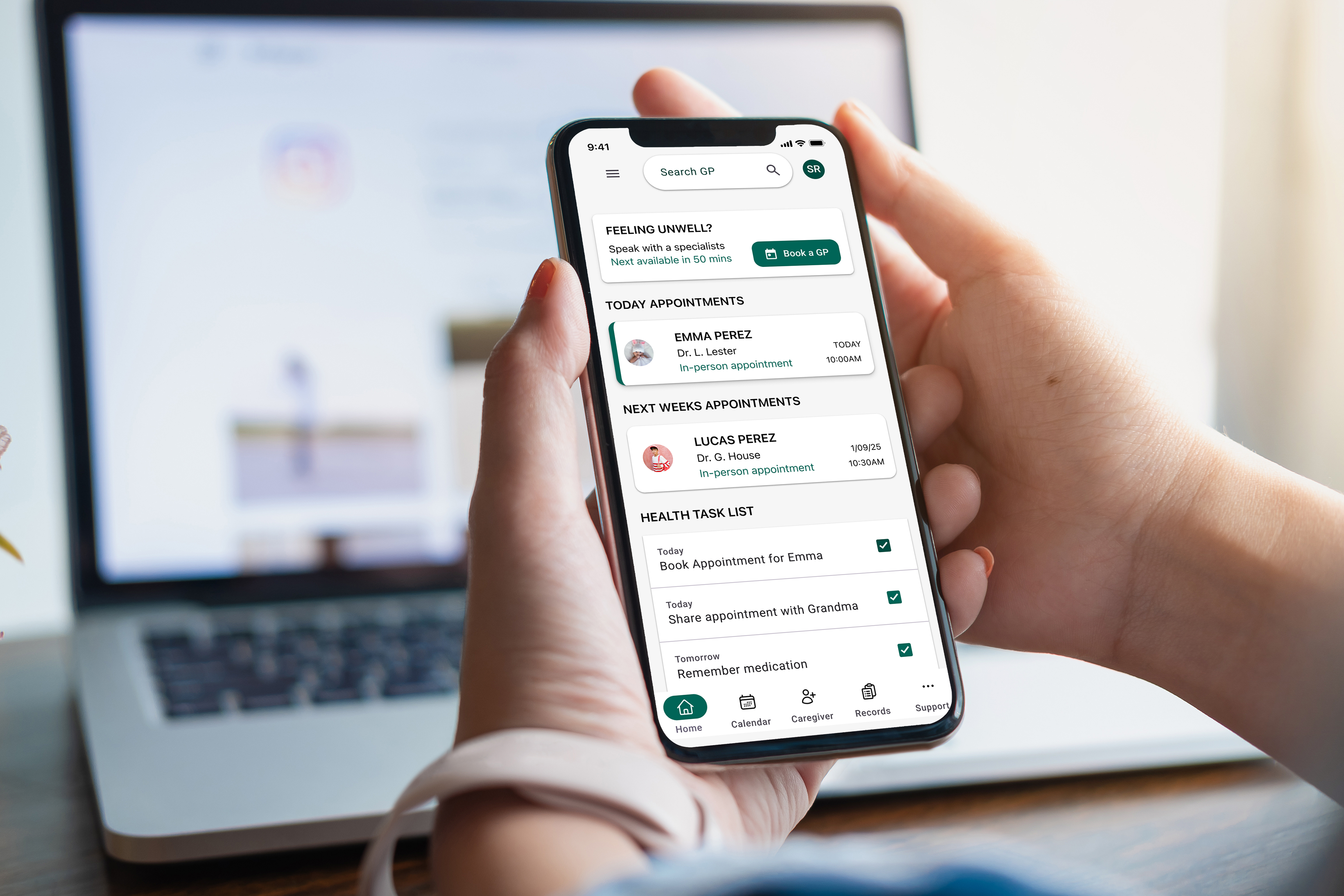
CareWell is a mobile app designed to help busy families easily book, track, and share children’s healthcare appointments. The goal was to create a calmer, clearer experience than existing GP systems, empowering parents with quick access to essential health information while supporting shared caregiving.
Role: Product Designer (UX/UI)
Timeline: 30 weeks
Tools: Figma, FigJam, Zoom, Google Forms
The Problem
Parents often struggle to manage medical appointments due to:
• Hidden or complex booking systems
• Overwhelming dashboards
• Confusing calendar structures
• Difficulty coordinating with caregivers
• Lack of emotional reassurance during stressful health moments
Design Solution at a Glance
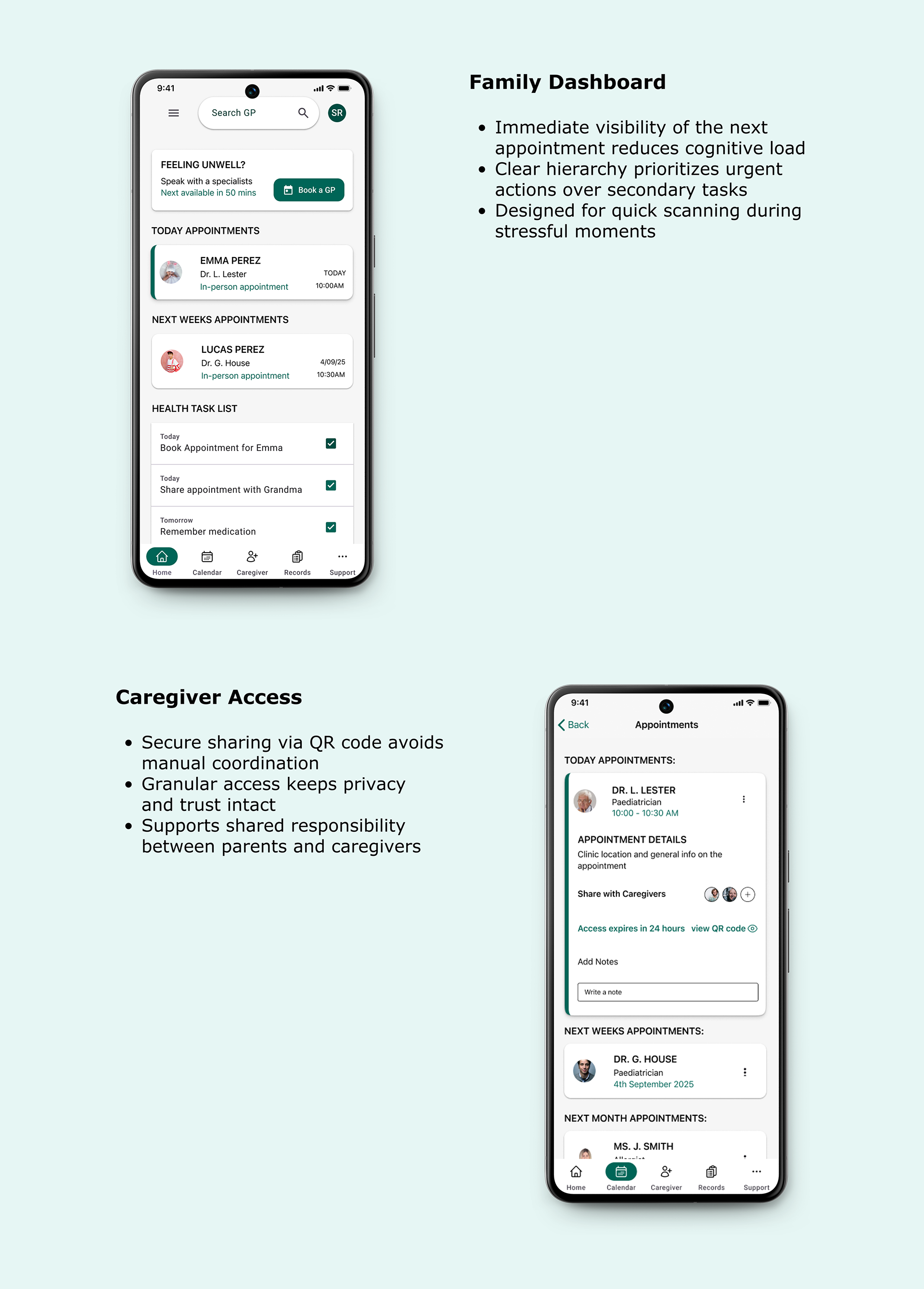
CareWell simplifies family healthcare by combining booking, tracking, and caregiver-sharing into a single, intuitive experience. The redesigned flow focuses on clarity, emotional engagement, and enhanced usability across both mobile and desktop platforms.
• Centralised family dashboard: one place to see upcoming appointments, tasks, and caregivers
• Prominent booking CTA: reduced missed bookings and decision time
• Clear caregiver sharing flow: confirmations remove uncertainty
• Calm, MD3-based UI: reduces stress during healthcare tasks
Understanding Families’ Needs
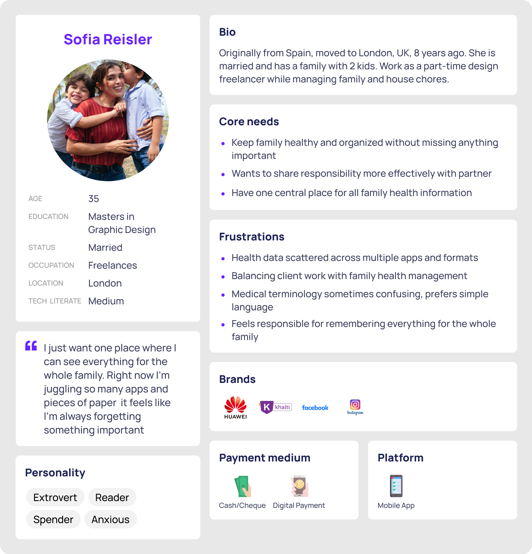
I conducted interviews and usability tests with 5 parents and caregivers (ages 30–45). Participants described feeling overwhelmed by healthcare admin and wanted:
• Immediate clarity about what’s coming up
• A fast way to book urgent appointments
• Easy sharing with caregivers
• A clean, calm interface
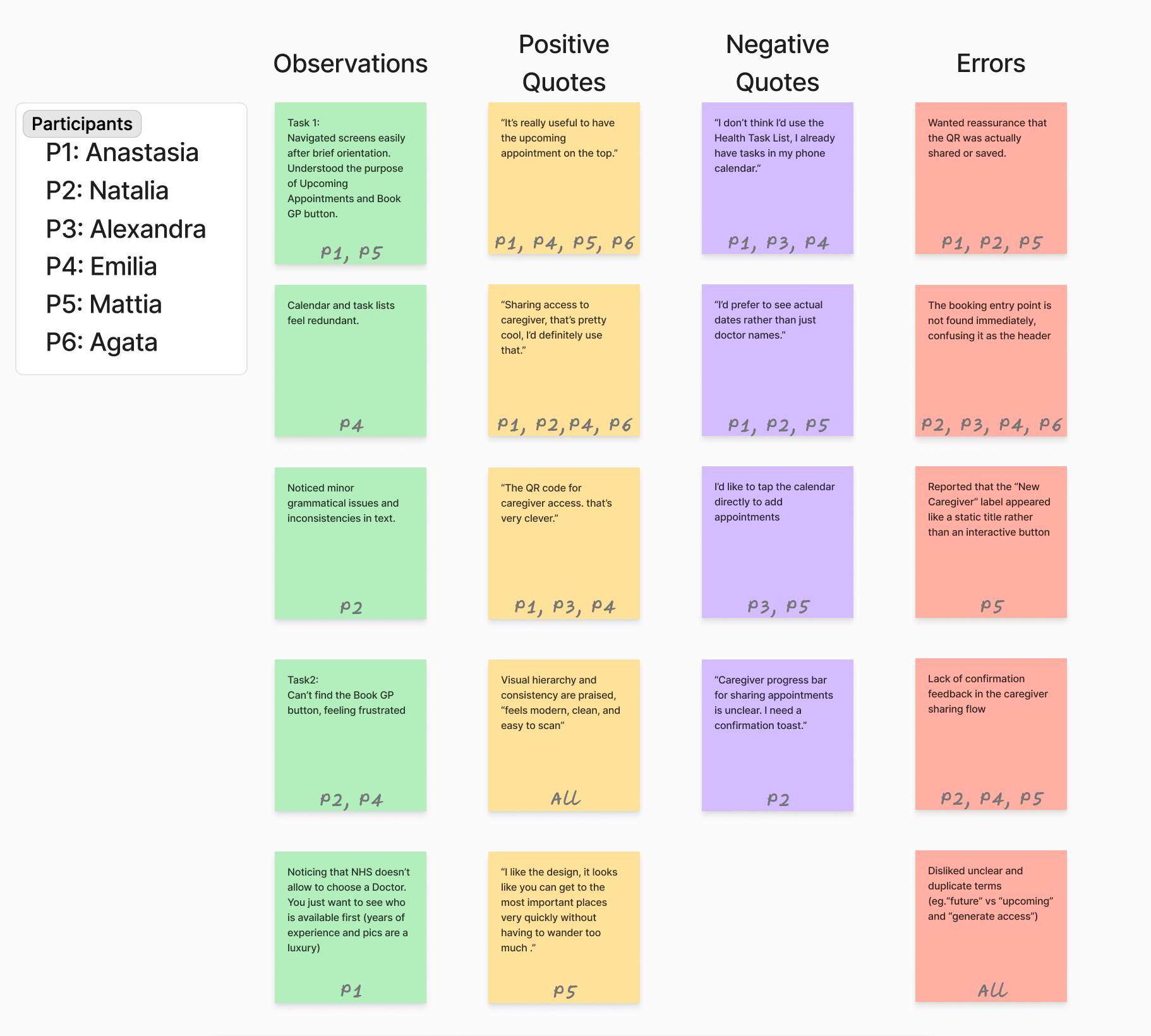
Key Findings
• Users want clear visibility of the week ahead without scrolling
• The booking button must be instantly visible; hidden CTAs caused frequent confusion
• The caregiver flow was unclear, leading users to question whether they had completed the action
• The distinction between “Upcoming” vs “Future” appointments was confusing
• Emotional reassurance (calming language, clear confirmation) is important during stressful health tasks
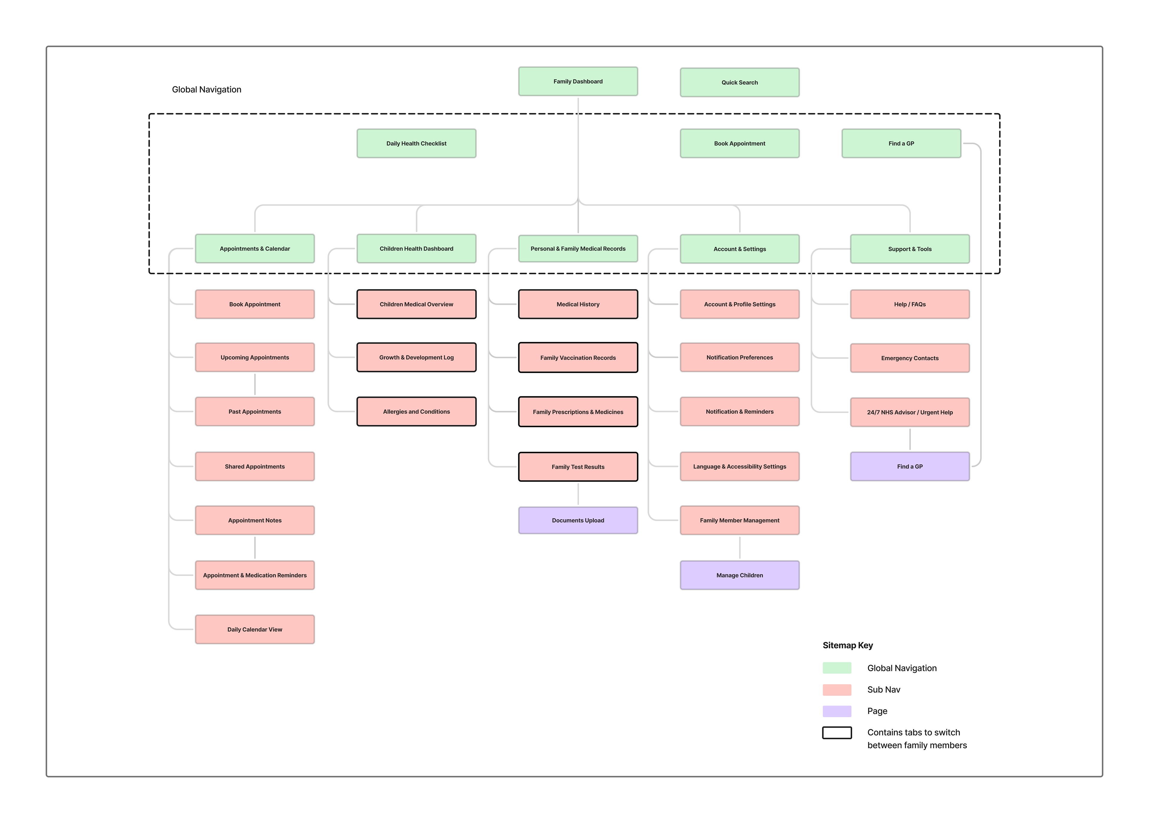
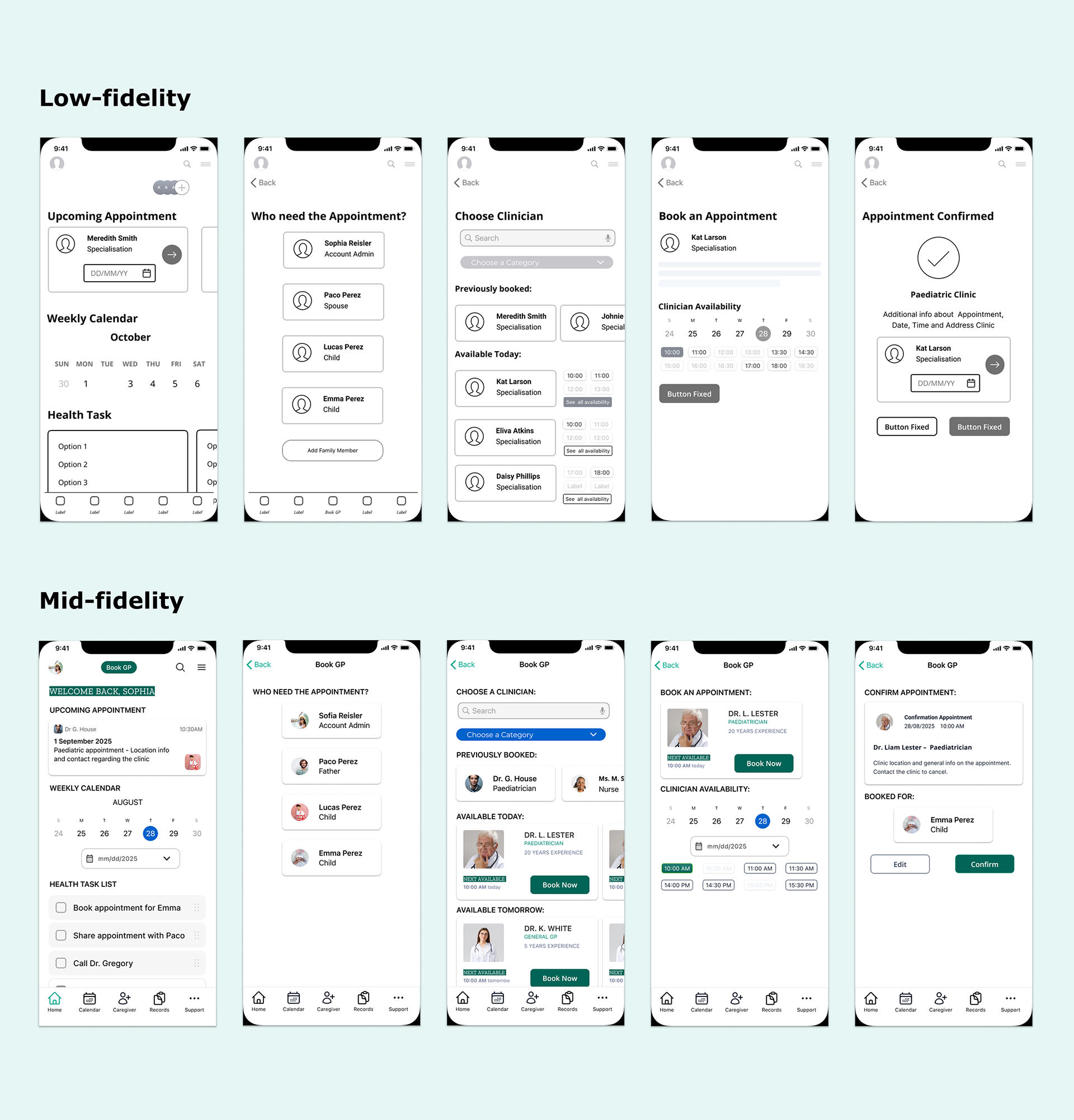
Simplified Sitemap and navigation
First Findings
• Booking CTA was ignored by 70% of participants
• Users are expected to tap directly on the calendar to add an appointment
• Caregiver confirmation lacked clarity
• “Upcoming vs Future” labels caused confusion
Changes Made
• Simplified dashboard structure
• Moved booking CTA to a more intuitive location
• Added clearer appointment hierarchy
• Refined caregiver UI
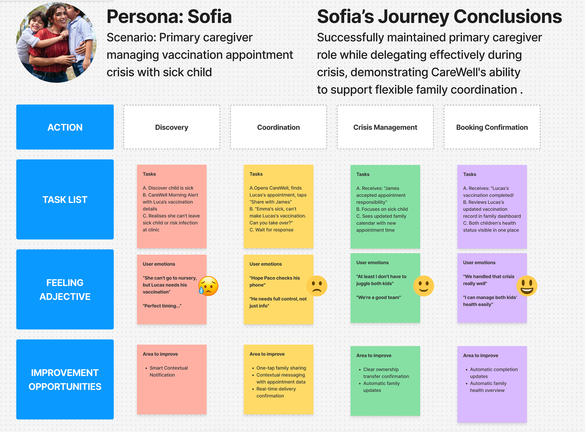
Turning User Feedback into Product Direction
Material Design Key Components Upgrade
• Replaced deprecated segmented buttons
• Updated booking card using MD list + supporting visuals
• Improved calendar navigation using MD tabs and chips
• Adopted MD3 elevations, spacing, and rounded corners
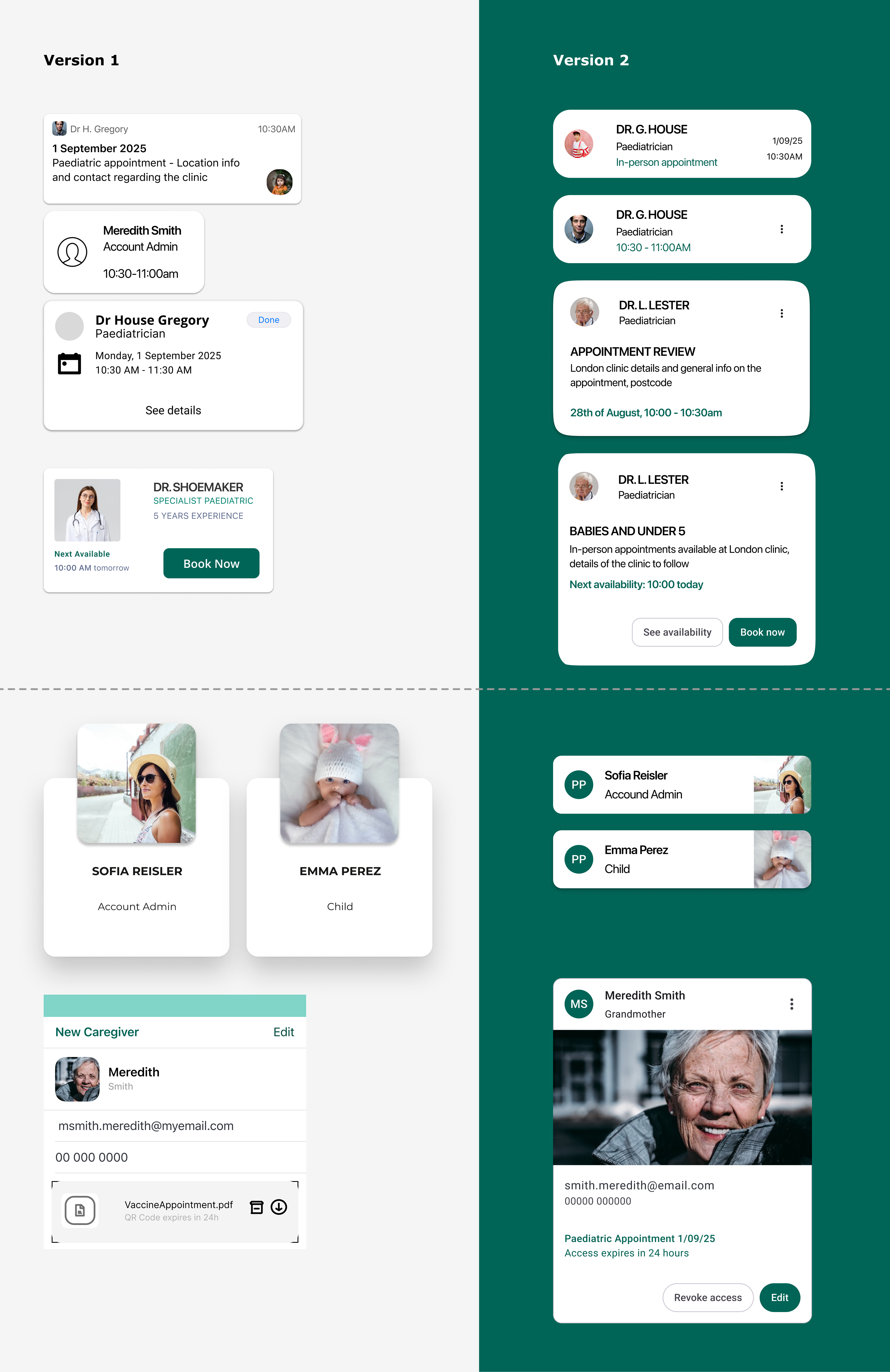
A More Logical, User-Friendly Path
The updated flow reduces cognitive load and makes booking clearer and faster.
Improvements:
• Booking CTA is now consistent and visible
• Appointment cards follow MD guidelines
• Caregiver flow includes confirmation steps
• Visual grouping improves scannability
• Reduced redundant steps
5 Moderated Usability Tests with Parents: Key Metrics
• Success Rate: 100% (after small prompt)
• Time on Task: improved by 45% after CTA redesign
• Error Rate: dropped significantly in caregiver flow
Guided flow that reduces decision fatigue
Impact
• Booking CTA visibility improved from 0% → 100% after redesign
• Caregiver flow confusion reduced by 80%
• Dashboard scanning time has been reduced significantly
• Emotional clarity improved user confidence
Next Step
• Accessibility testing with assistive technologies
• Quantitative validation (NPS, satisfaction scores)
• Expand caregiver permissions and reminders
Test the prototype
Final Thought
CareWell demonstrates how thoughtful UX and emotional design can meaningfully reduce friction in everyday healthcare management for families