Project Overview
Roundabout was a 3-week website redesign project for a dramatherapy charity, focused on improving structure, clarity, and user engagement across the experience. The aim was to make key information easier to find, better communicate the value of the service, and support more meaningful actions such as learning about dramatherapy, getting in touch, or donating. I worked as a UX Designer, leading the research and experience design process while collaborating with the UI team on the final direction.
Roundabout was a 3-week website redesign project for a dramatherapy charity, focused on improving structure, clarity, and user engagement across the experience. The aim was to make key information easier to find, better communicate the value of the service, and support more meaningful actions such as learning about dramatherapy, getting in touch, or donating. I worked as a UX Designer, leading the research and experience design process while collaborating with the UI team on the final direction.
Role: UX Designer
Timeline: 3 weeks
Tools: Google Analytics, Google Forms, Sketch, InVision
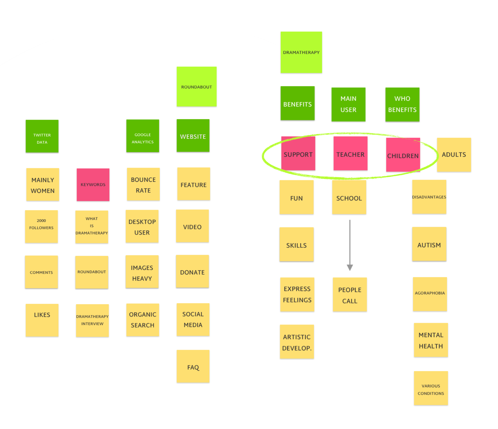
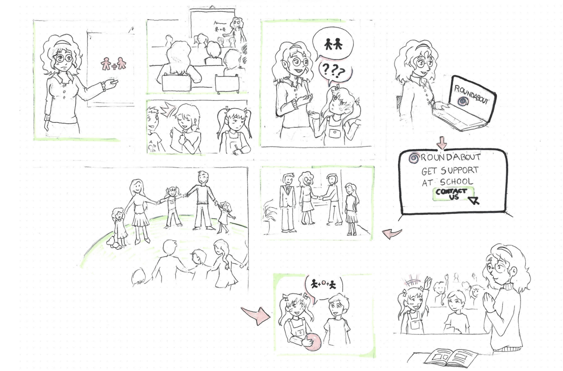
Affinity Diagram and Storyboard
The Problem
Roundabout’s existing website lacked a clear structure and made important content difficult to reach, which limited both engagement and usability. The experience also failed to reflect the sense of support and professionalism that defined the charity’s work in person. The challenge was to redesign the site into a responsive experience that could better communicate the value of dramatherapy, guide different audiences more clearly, and make key actions such as getting in touch or donating easier to complete.
What I changed
I led the UX process for the redesign, from research through to wireframes and prototype structure, while collaborating with the UI team on the final visual direction. My work included analysing existing site behaviour, running an online survey, defining personas and user journeys, restructuring the sitemap, and developing wireframes for desktop and mobile. These decisions helped reshape the experience around clearer navigation, more relevant content, and more actionable user flows.
Key design decisions
• Reworked the sitemap to make key content easier to discover and better aligned with user needs
• Prioritised information hierarchy and calls to action so users could more easily understand the service, contact the charity, or donate
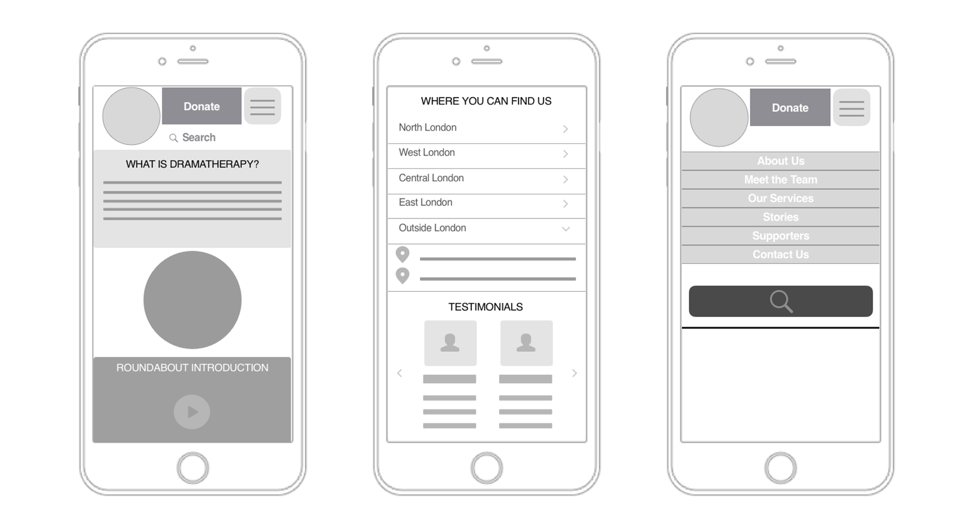
• Simplified the mobile experience by adapting components and layouts to make content easier to scan and navigate on smaller screens
• Focused the experience around clearer user journeys, helping different audiences find the information most relevant to them more quickly
Mid-fidelity prototype
Why it matters
Roundabout needed to serve multiple audiences, including teachers, parents, and supporters, but the experience had to feel clear and approachable rather than content-heavy or fragmented. By improving structure and prioritising key information, the redesign made the service easier to understand and the website more useful as a point of access. This mattered not only from a usability perspective, but also because the digital experience needed to better reflect the trust, care, and professionalism already present in the charity’s real-world work.
Validation
Validation for this project came first through research and testing, using analytics, survey feedback, and iterative review to improve structure, navigation, and clarity. Unlike some of my other early projects, this work also moved into a live responsive website that continues to support the charity’s online presence today. That makes the project meaningful not only as a design exercise, but as work that contributed to a real service environment. The charity’s website is currently live, with public pages for its services and information.
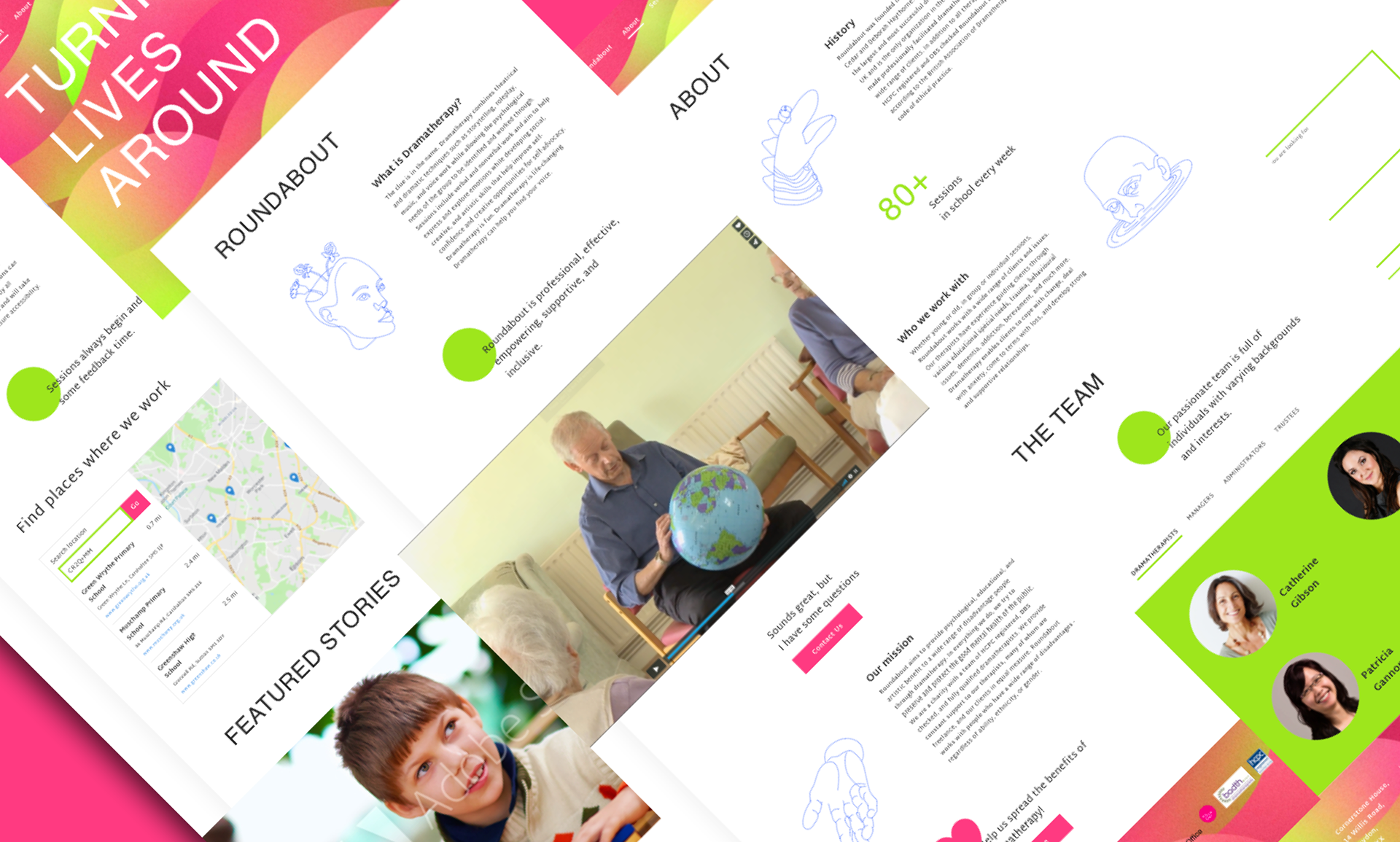
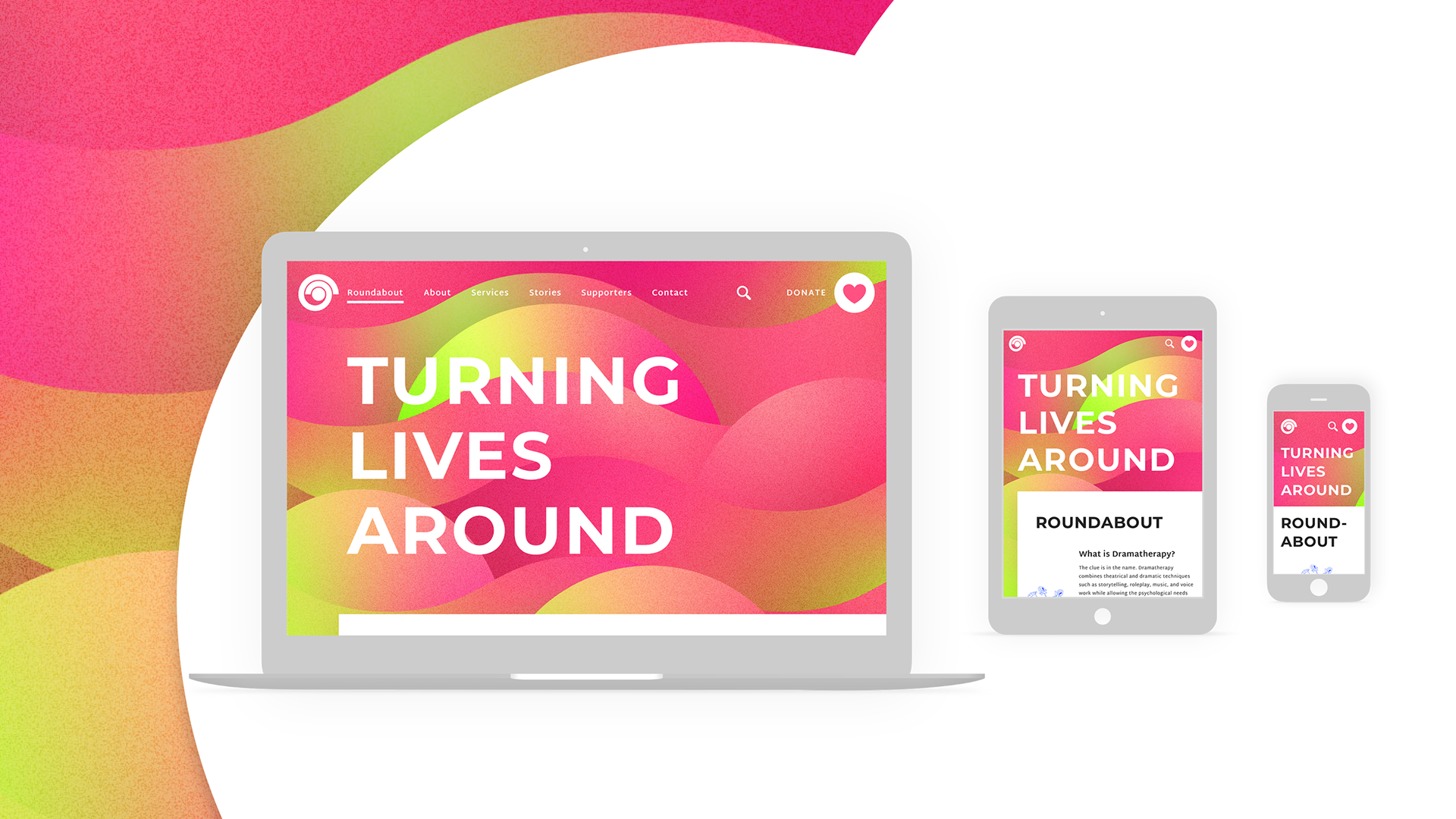
Final responsive prototype
Final thoughts
This project strengthened my ability to work end-to-end under time pressure, balancing research, information architecture, and interaction design within a short delivery window. It also gave me a stronger understanding of how content structure and prioritisation directly shape the clarity and effectiveness of an experience. Looking back, I also see it as an earlier stage in my practice, particularly in relation to accessibility. Some visual choices, especially around colour contrast, would not meet the standards I would apply today. Revisiting the project now reinforces the importance of designing for accessibility from the outset, especially in live public-facing services.