Project Overview
Bloomsbury Beginnings was a 3-week web browser–based mobile app project centred on designing a new Members Area and reworking key parts of the existing experience for mobile.
After previously contributing to the UX phase, I joined the UI team to carry those research insights into the visual design, helping shape a more cohesive and user-informed final interface.
Role: UI Designer
Timeline: 3 weeks
Tools: Sketch, InVision, Google Forms
The Problem
The service needed to extend engagement beyond face-to-face events and offer members a digital space that felt easy to use, supportive, and scalable. At the same time, parts of the existing experience needed to be rethought for a more app-like mobile interaction.
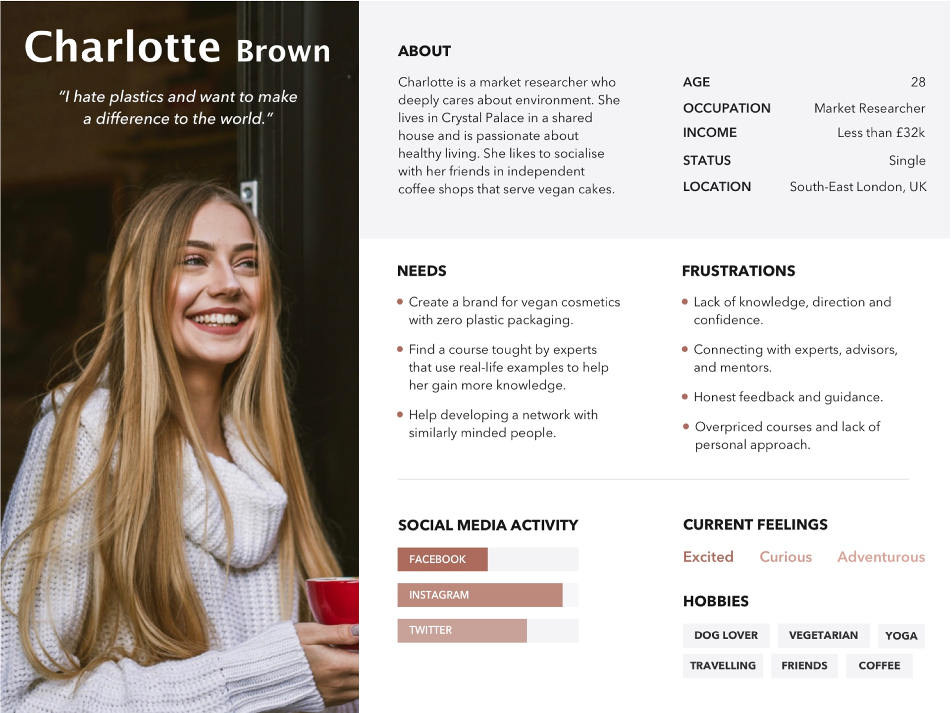
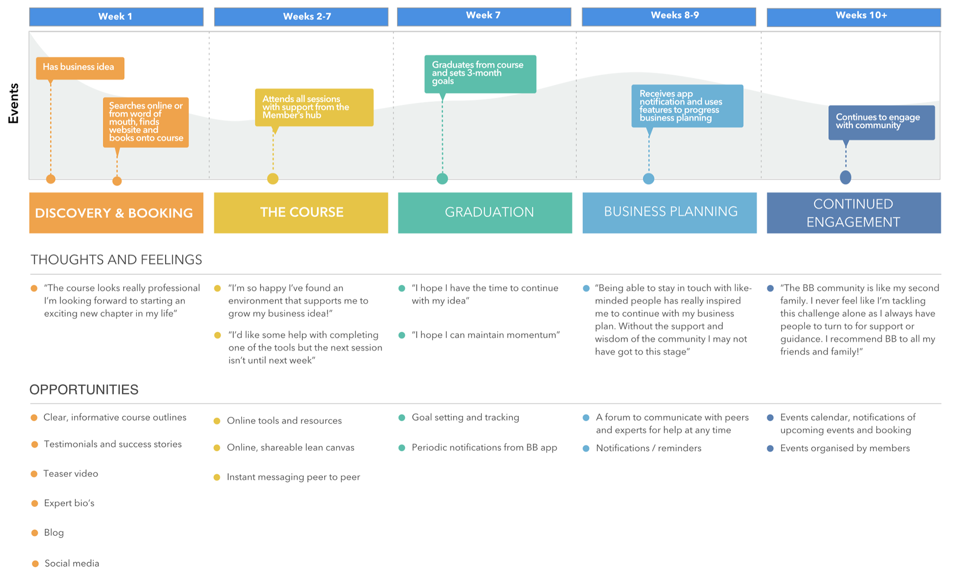
User persona & User Journey
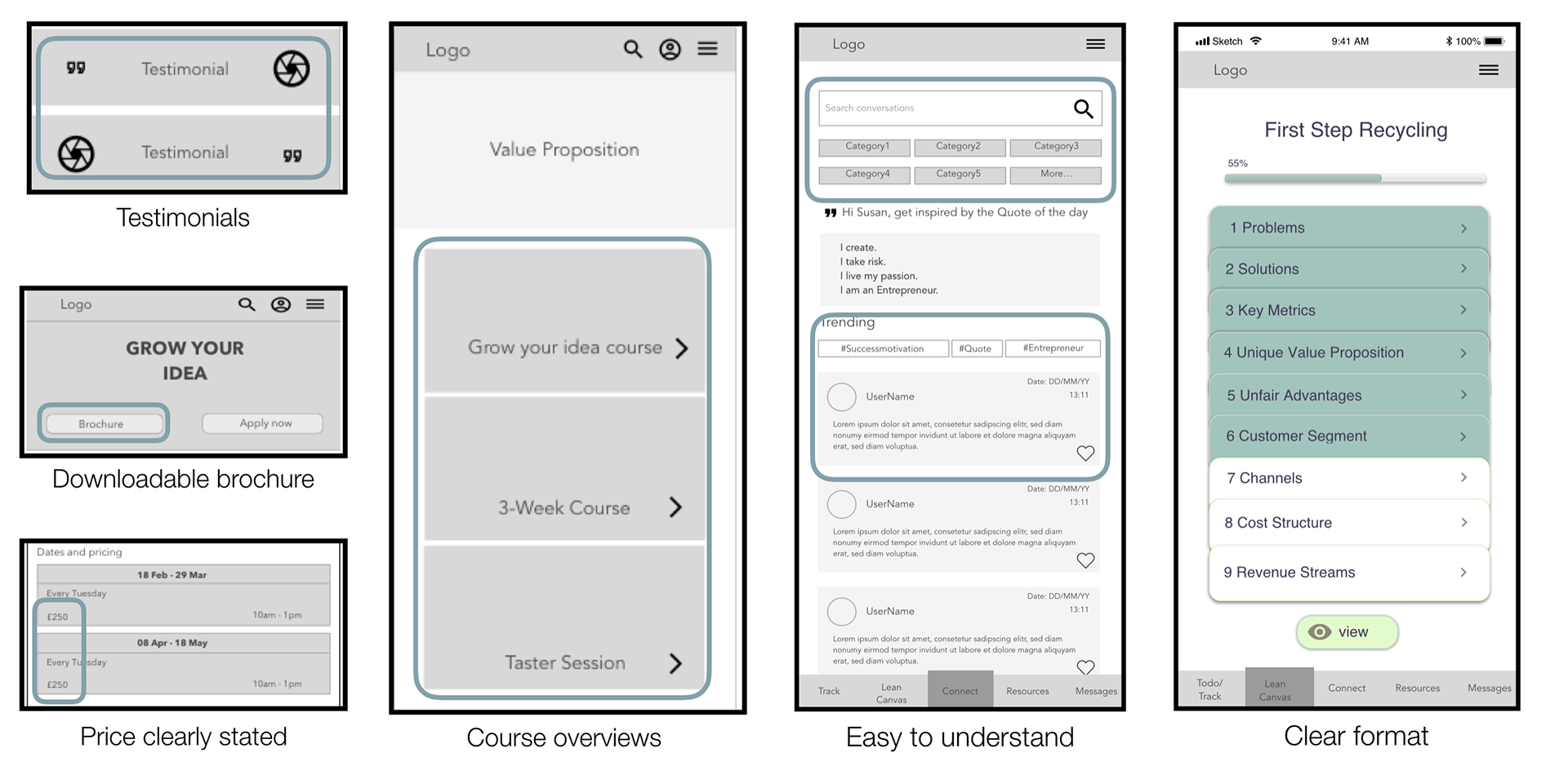
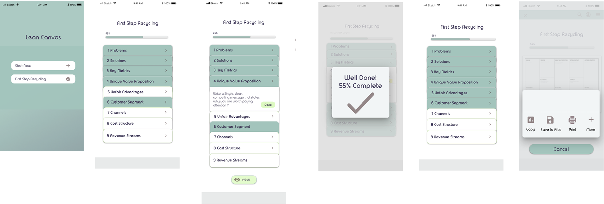
What I changed
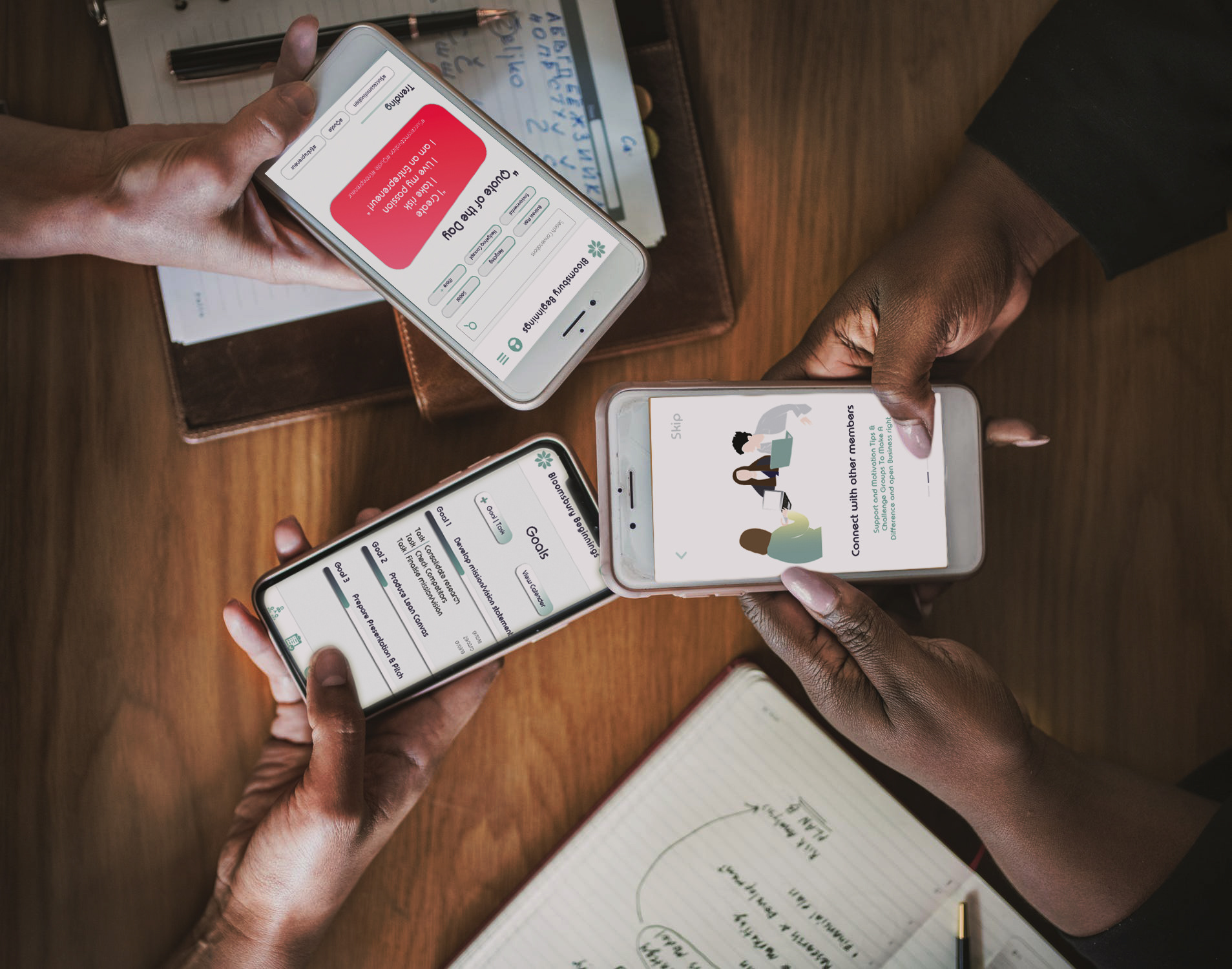
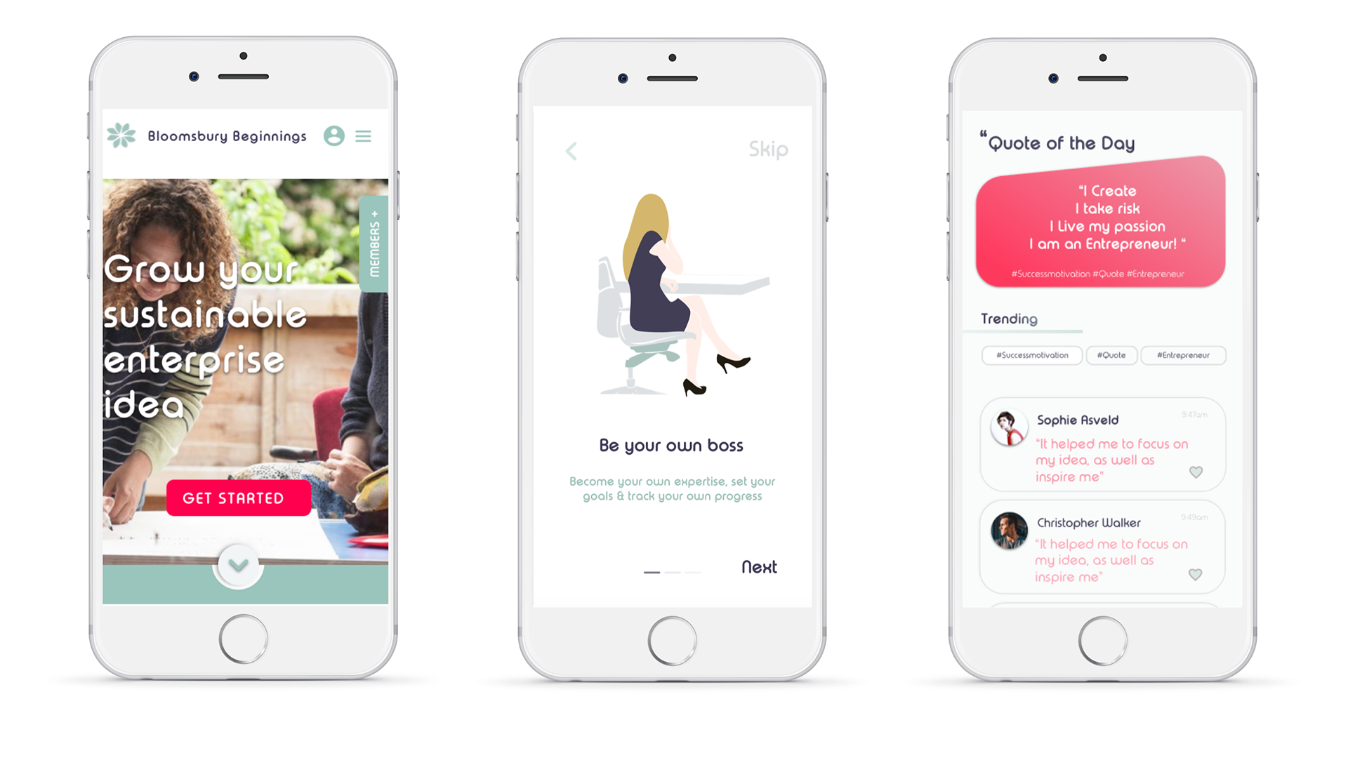
I focused on making the Members Area easier to understand and navigate on mobile, using prior UX insights to simplify the structure and support continued engagement outside face-to-face sessions.
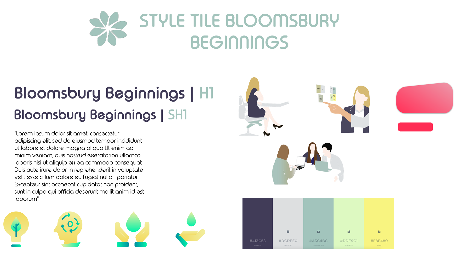
My contribution included shaping the visual language of the app through Material Design principles, iconography, and a minimal interface structure designed to support quick and intuitive interaction.
I also contributed to the rebranding process by revisiting the existing logo and exploring a new direction rooted in circularity, repetition, and natural forms.
Key decisions:
• Simplified the Members Area structure for easier mobile navigation
• Used Material patterns and iconography to support familiarity and speed
• Refined the visual identity to make the experience feel more cohesive and recognisable
Why it matters
This approach helped balance usability and identity. The interface became cleaner and more functional, while the updated logo gave the product a simpler but more distinctive visual expression.
Because the product was extending a real-world service into a digital environment, clarity and ease of interaction were essential. The redesigned mobile experience helped make the service feel more accessible and consistent, while supporting continued engagement outside in-person sessions.
Validation
The interface direction was informed by earlier UX work, including user personas and journey mapping, which helped ground the visual design in user expectations, emotions, and follow-up needs across the service experience.
The interface direction was informed by earlier UX work, including user personas and journey mapping, which helped ground the visual design in user expectations, emotions, and follow-up needs across the service experience.
New Members Area development
Branding and final prototype
Logo development
As part of the rebrand, we revisited the existing logo and previous design direction to identify what should be preserved and what needed to evolve. The final concept was informed by ideas of circularity, repetition, and connection to natural elements, resulting in a mark that felt simple, minimal, and distinctive.
Final thoughts
This project stood out for its collaborative, fast-paced environment, with multiple groups working on the brief simultaneously.
I found that level of comparative pressure challenging, but it also encouraged more focused design decisions and a stronger sense of iteration.
This project was built on earlier UX research, allowing me to translate user needs into a clearer mobile interface and more cohesive visual system for a new Members Area experience.