I was assigned to develop a brand identity and visual style for an online Ruby Gem, aiming to promote the accessibility and overall engagement of the final website.
The landing page needed to be easy to navigate and highlight key elements of the Gem calling the attention of tech users.
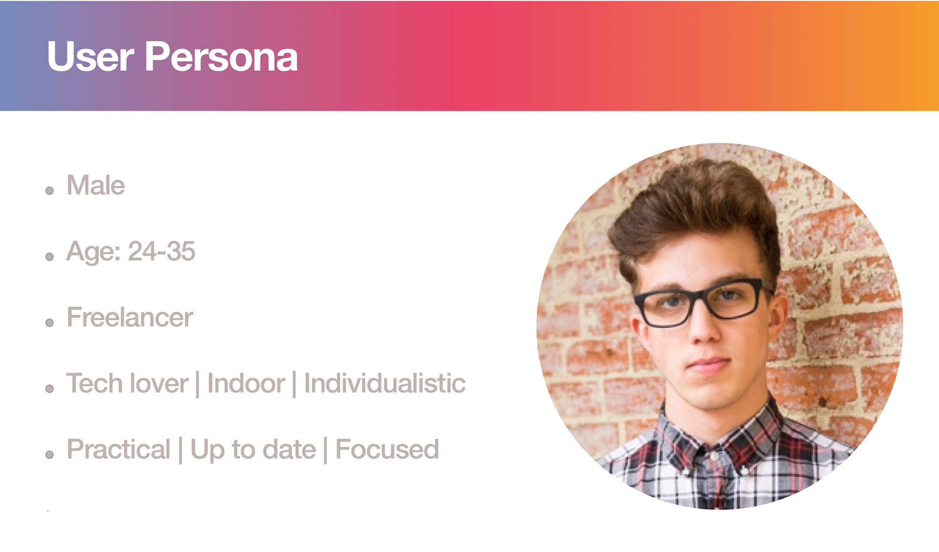
Focusing on the target audience and their needs, in this case a young freelancer looking for tech support, I created a branding that incorporates that modern and clean feeling.
The main content of the website should focus on the social side of Faraday and integrate with creative tech elements.
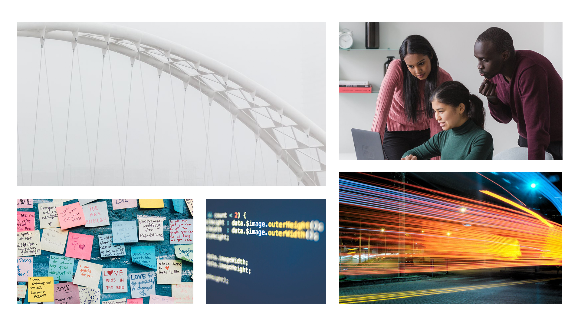
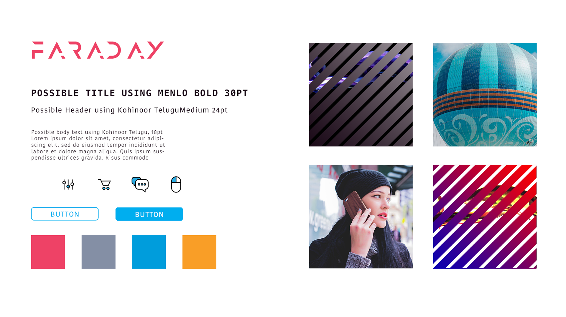
Mood board and Style Tile
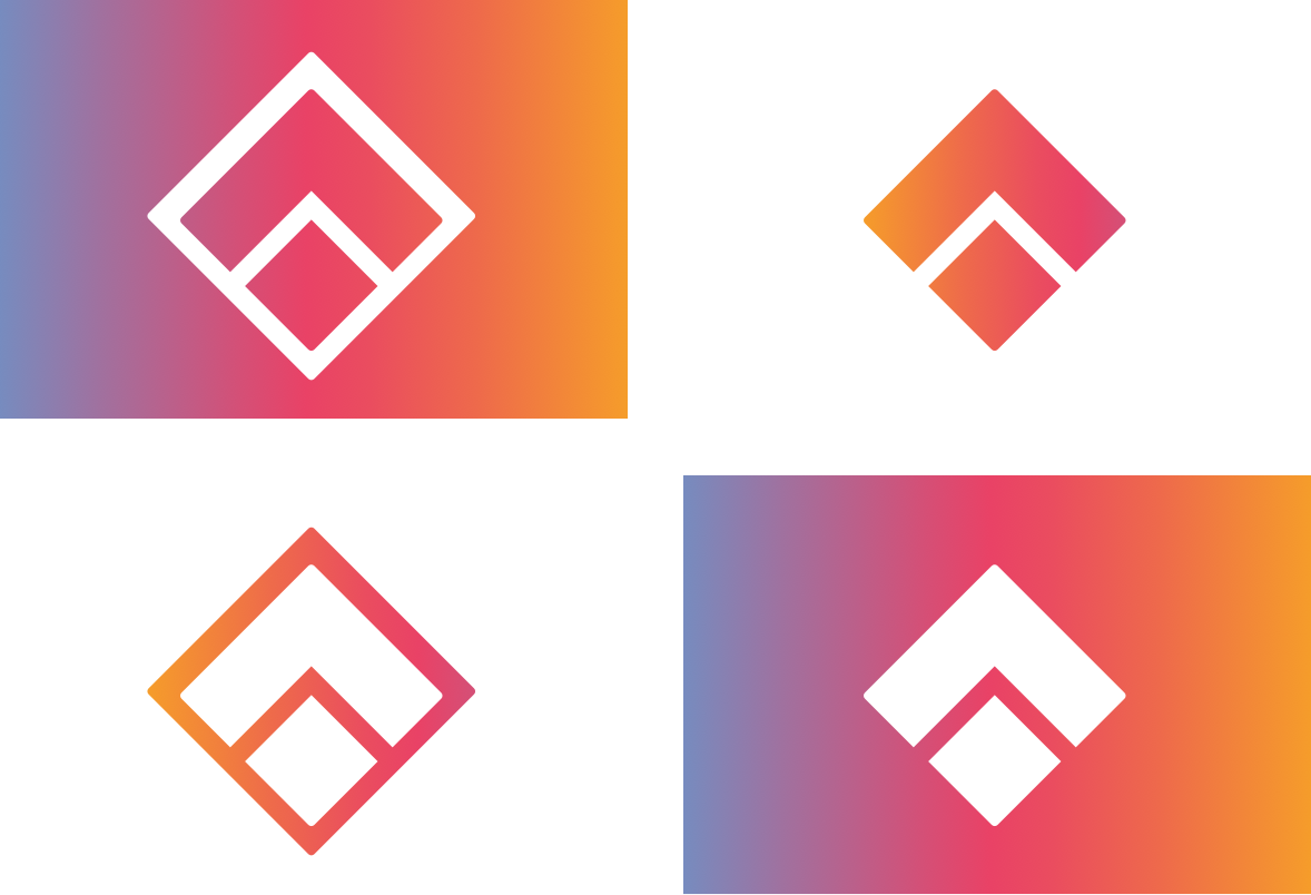
Branding and logo variations
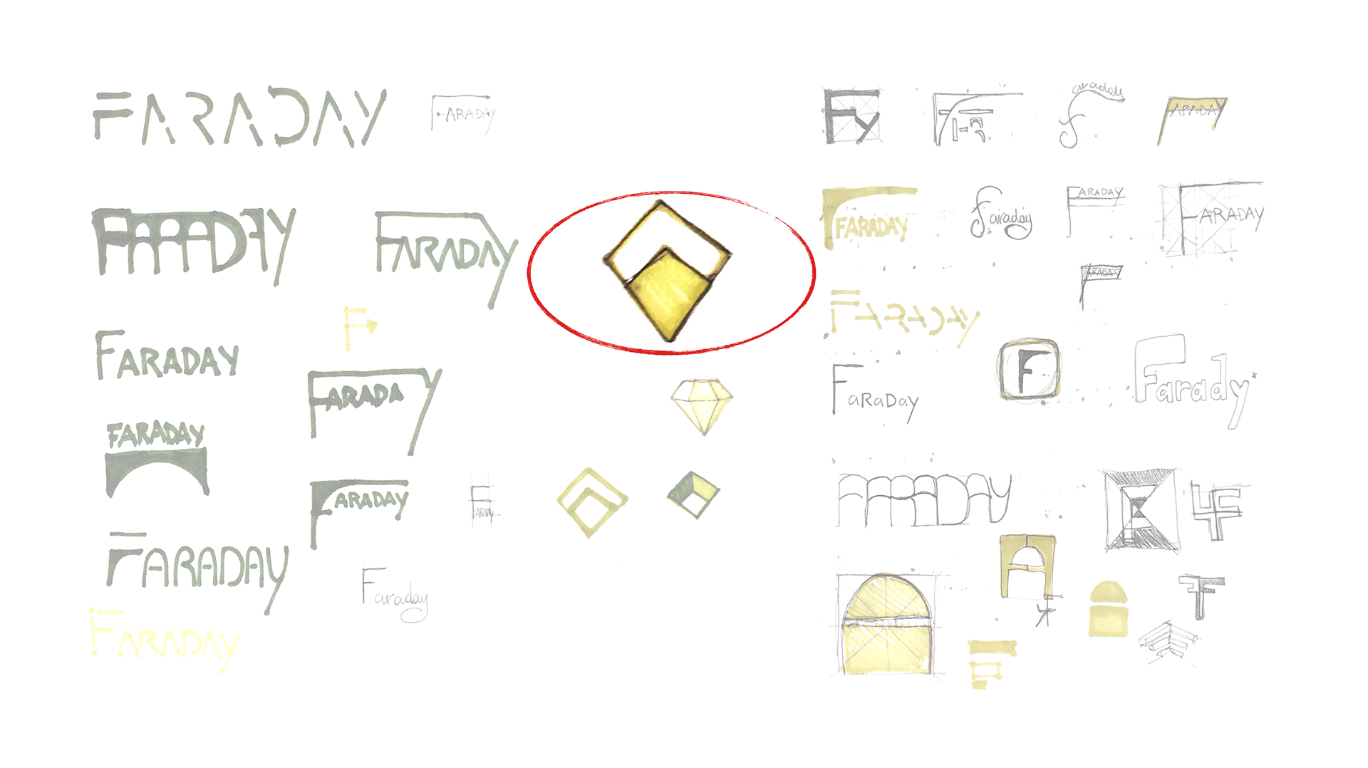
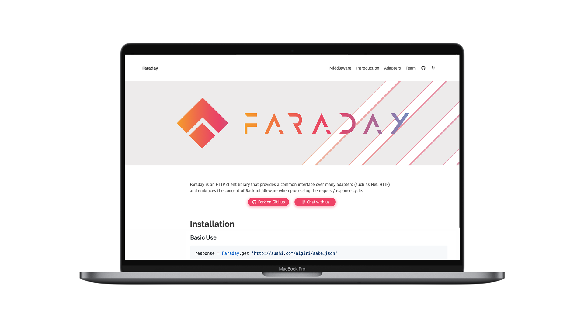
Analysing the why and the concept of Faraday we can find relationships with the idea of “bridge” that connect different places bringing communication and understanding.
After developing a combination of visual graphics with the name and bridges or stand-alone studies of the name, I decided to bring forward the shape of the rhombus because of its association with diamond, the remainder of a masculine and active shape.
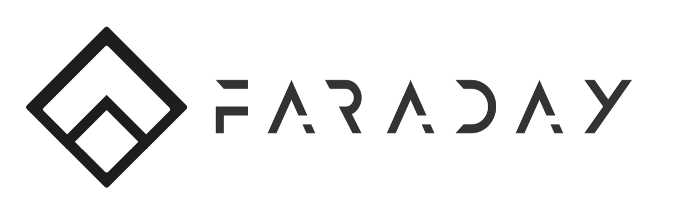
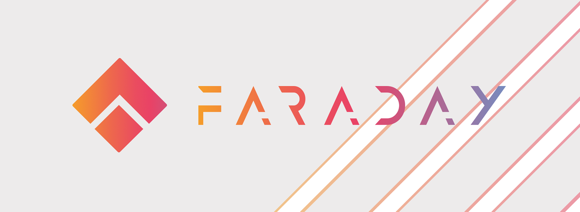
Final website banner
The website has been recently updated to welcome a dark theme maintaining the pre-existing branding.